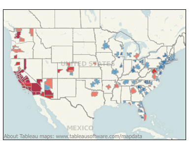
This is an interesting map I just found on Zillow, via Tableau Software. It shows the status of home selling in the USA. Darker blue means houses are sitting longer and selling for less than asking… darker red means houses are selling faster and closer to asking price or over asking price. Sure looks like there is a migration going on. Is it just boomers retiring? I don’t know. All I can say is here they come… whoever they are.
Posts Tagged ‘western migration’
heat map of where homes are selling and not selling
Posted in city planning, san luis obispo, trend forecasting, tagged best place to live, California population, housing price trends, real estate trends, western migration on April 26, 2014| Leave a Comment »
